Mira is getting
a little grooming!
On the occasion of its 45th anniversary, Mira is unveiling a refreshed brand identity. Warmer, more expressive, and deeply human, this evolution marks an important milestone in the foundation’s history. It celebrates 45 years of commitment, expertise, and impact in the lives of those supported by a Mira dog.
Our mission remains the same: changing lives, one dog at a time.
This new identity is an invitation to discover Mira’s mission and to feel, more than ever, the profoundly human dimension of its cause. It allows Mira to tell its stories with even greater authenticity, warmth, and closeness, while staying true to what has made it strong all these years.
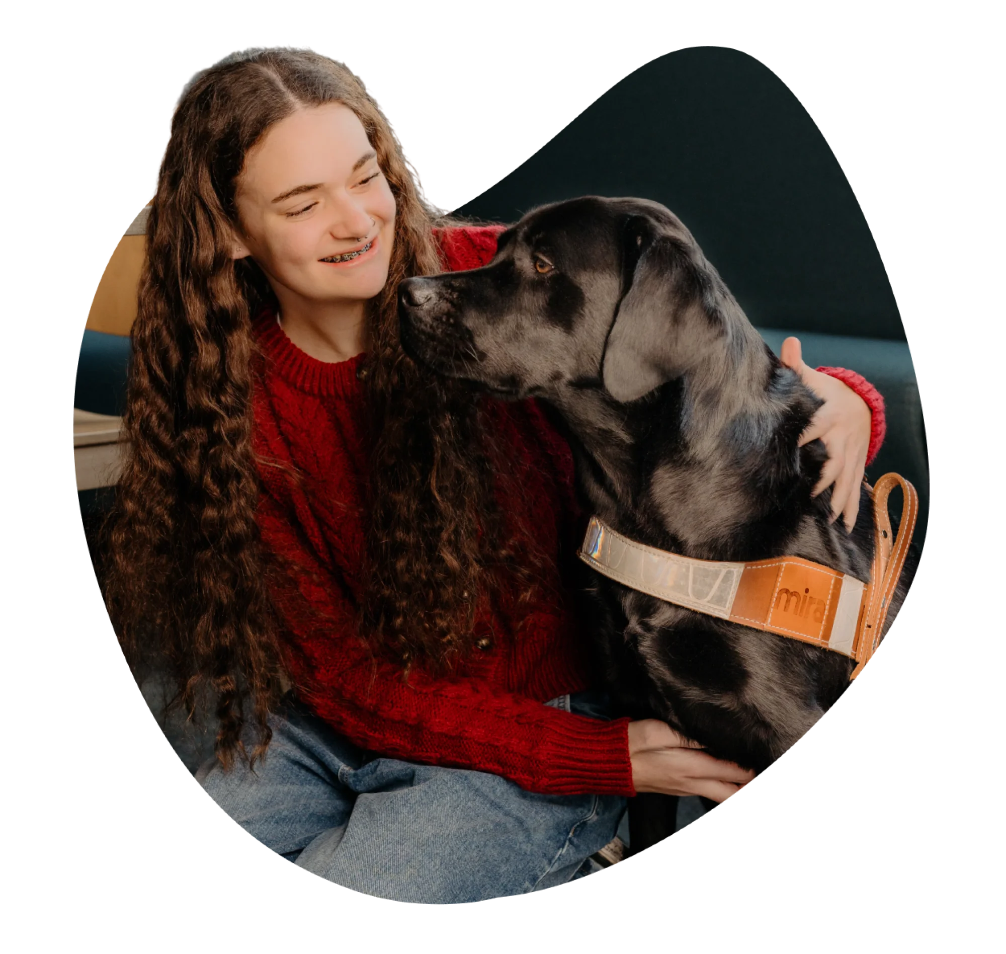
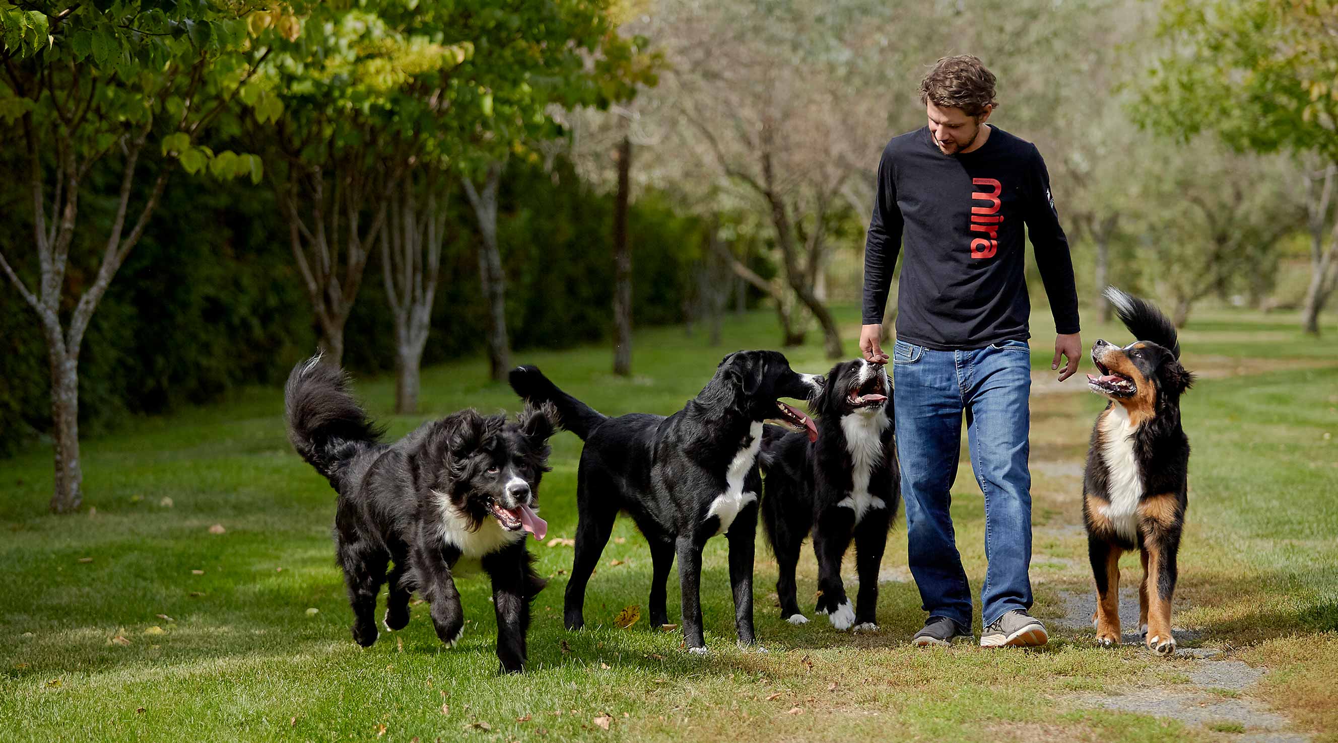
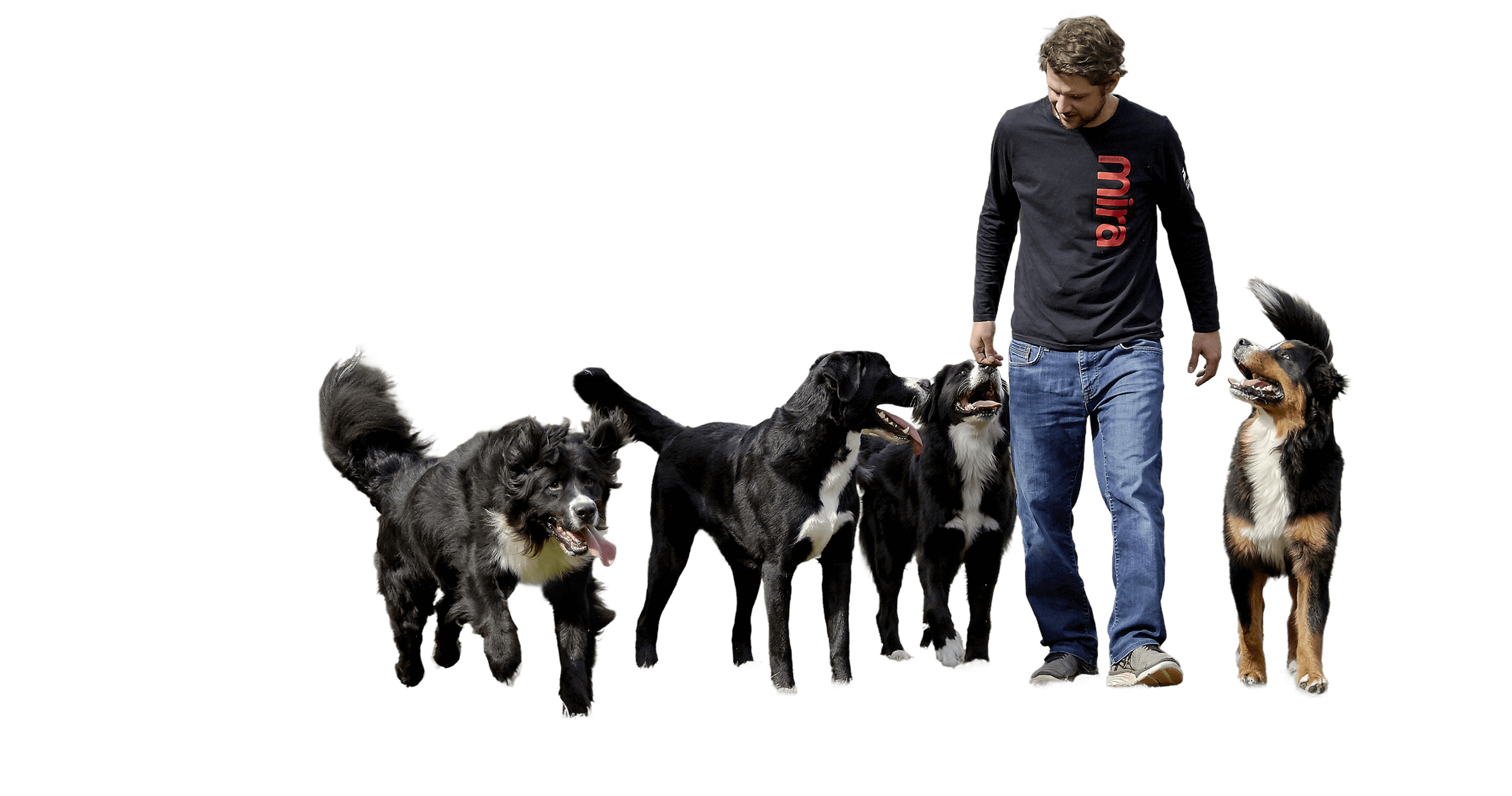
The duos at the heart of the brand
Recognized as a leader in guide and assistance dogs in Canada, Mira is evolving its brand identity to highlight the unique bond between the dog and its beneficiary, emphasizing the depth of this transformative relationship. The duos thus become the cornerstone of the brand image—authentic relationships built on trust, safety, and companionship.
Each story shared highlights both the small and meaningful everyday moments made possible thanks to Mira dogs.
A visual universe reflecting the bonds
that unite us
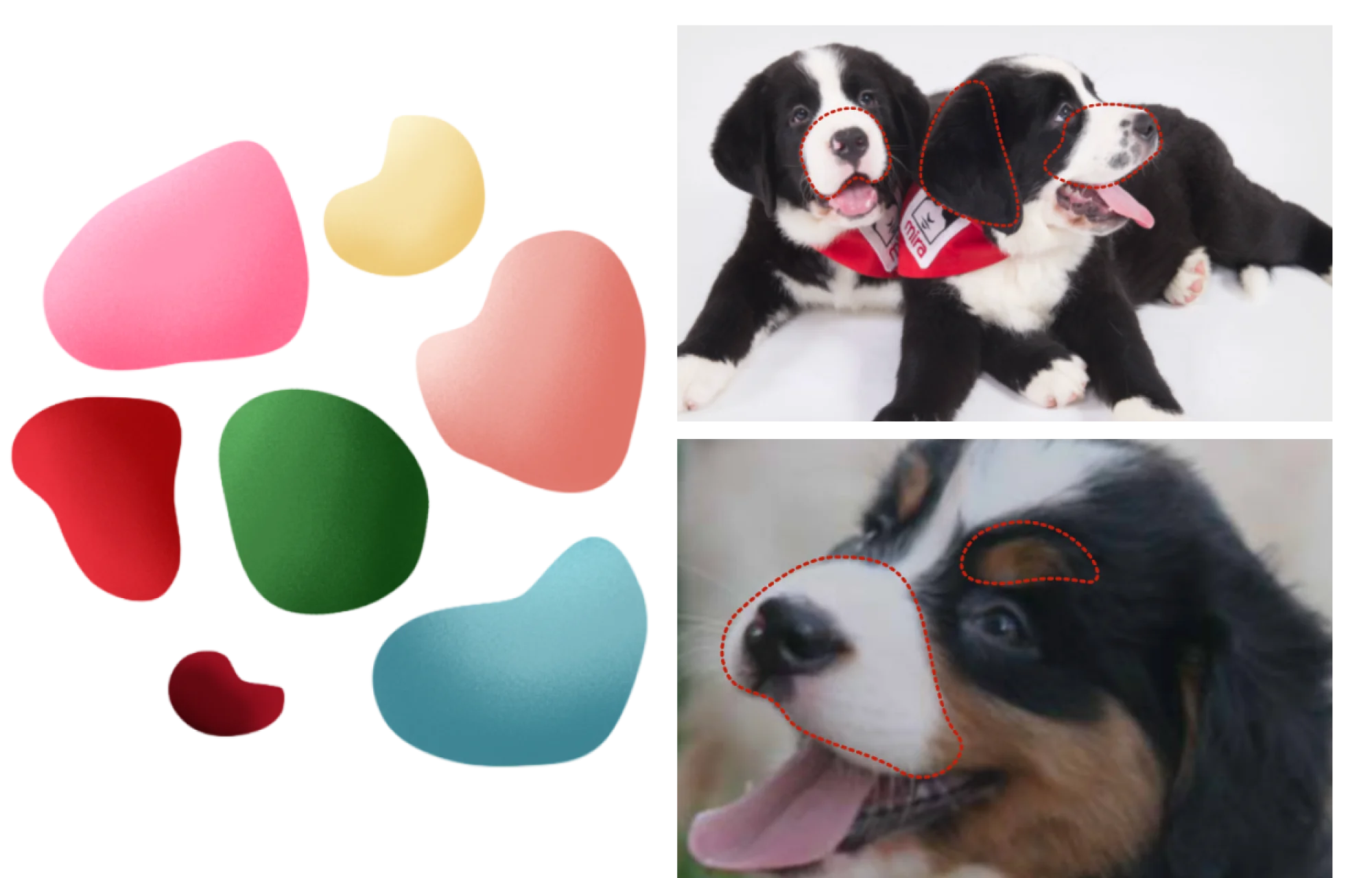
The shapes
The graphic shapes are directly inspired by the physical characteristics of our dogs:
muzzles;
ears;
eyebrows.
These organic shapes help create a vibrant visual language deeply connected to the canine world.
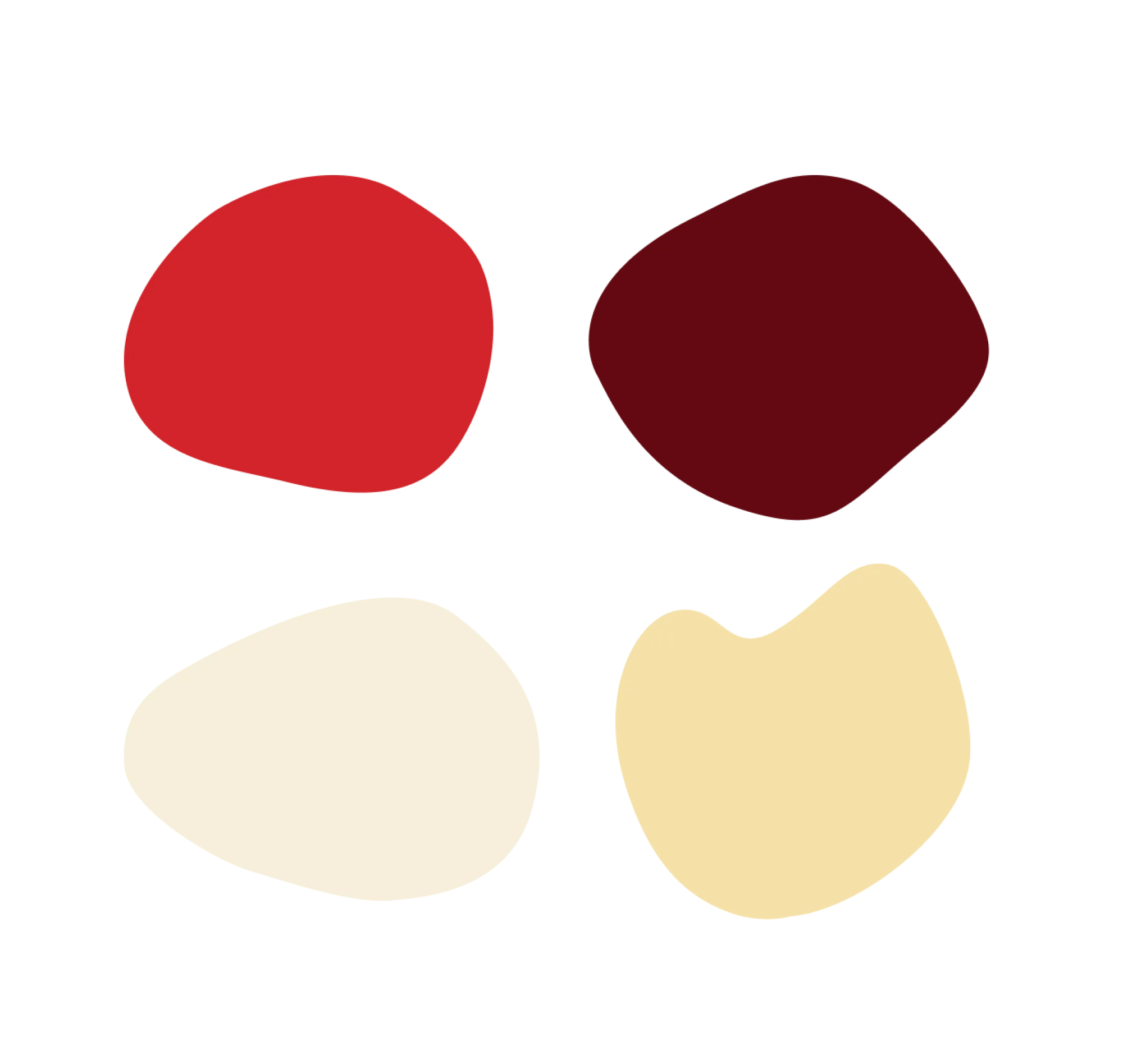
The colors
Primary colors
The primary colors are rooted in the continuity of Mira’s identity. They reflect its history, recognition, and the strong foundations of the brand.
Mira Red embodies the brand’s heritage, deeply rooted in the hearts of Quebecers. It reflects the dynamism and determination of its founders.
Mira Burgundy evokes expertise, depth, and maturity. It brings a sense of conviction and visual richness that reflects Mira’s knowledge and experience.
Labrador Cream, soft and soothing, is a warm variation of white. It suggests comfort, humility, and closeness.
Bernese Caramel symbolizes warmth and welcome. Its rich tones create an intimate and inviting atmosphere, fostering a sense of trust and care.
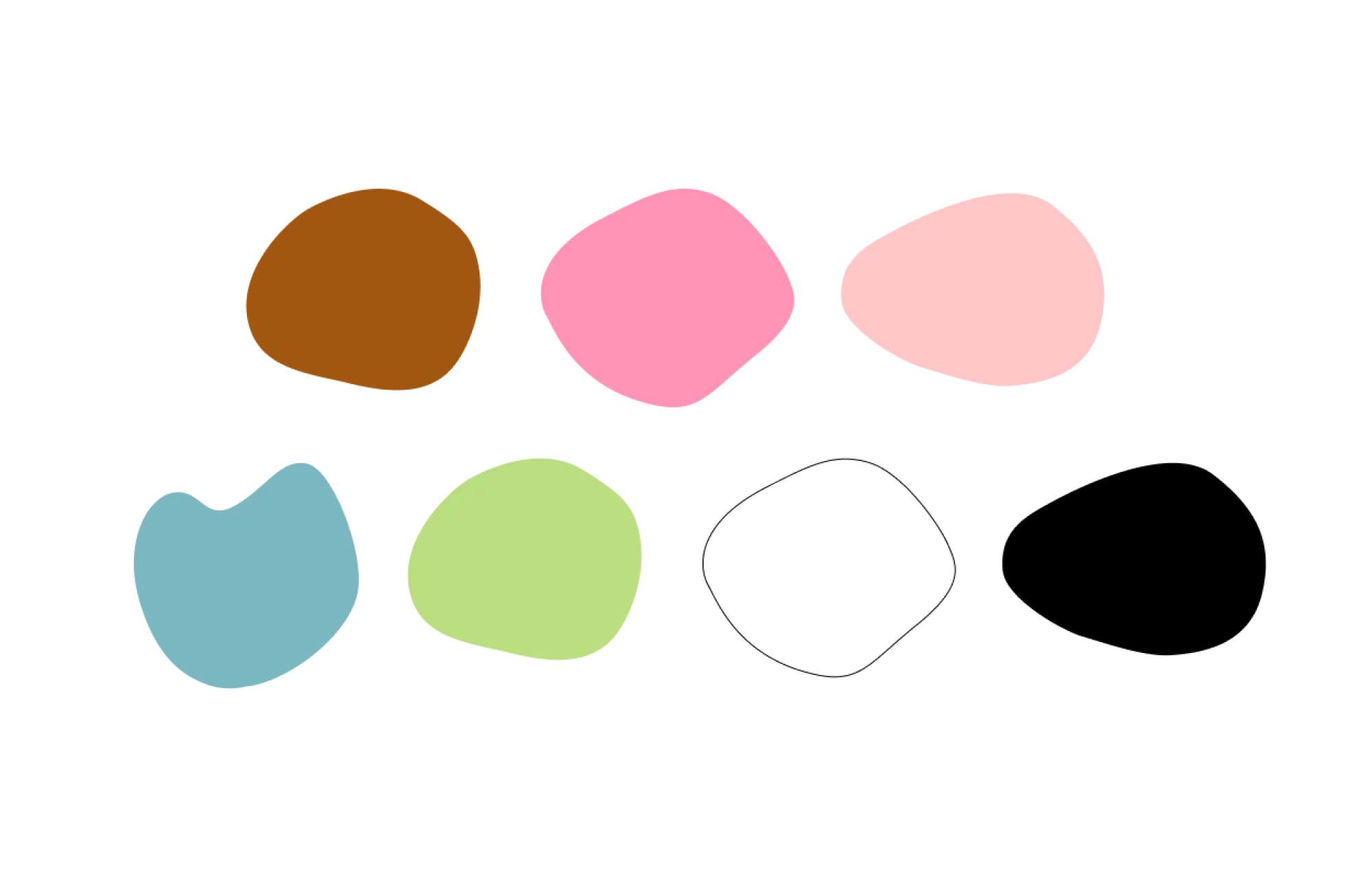
Secondary colors
The secondary colors enrich the palette. More expressive and vibrant, they bring renewed energy and allow the brand to express itself with greater flexibility and modernity.
Brown refers to the color of Mira guide and service dogs’ harnesses.
Pink represents sensitivity, as well as both the human and the dog in their most vulnerable form.
Beige Pink highlights the mutual trust within the formed duos, as well as the community’s trust in Mira.
Cream Blue evokes well-being; it is a calming color.
Prairie Green illustrates resourcefulness and the green spaces essential to the well-being of Mira dogs.
Black and White represent contrast and the search for balance.
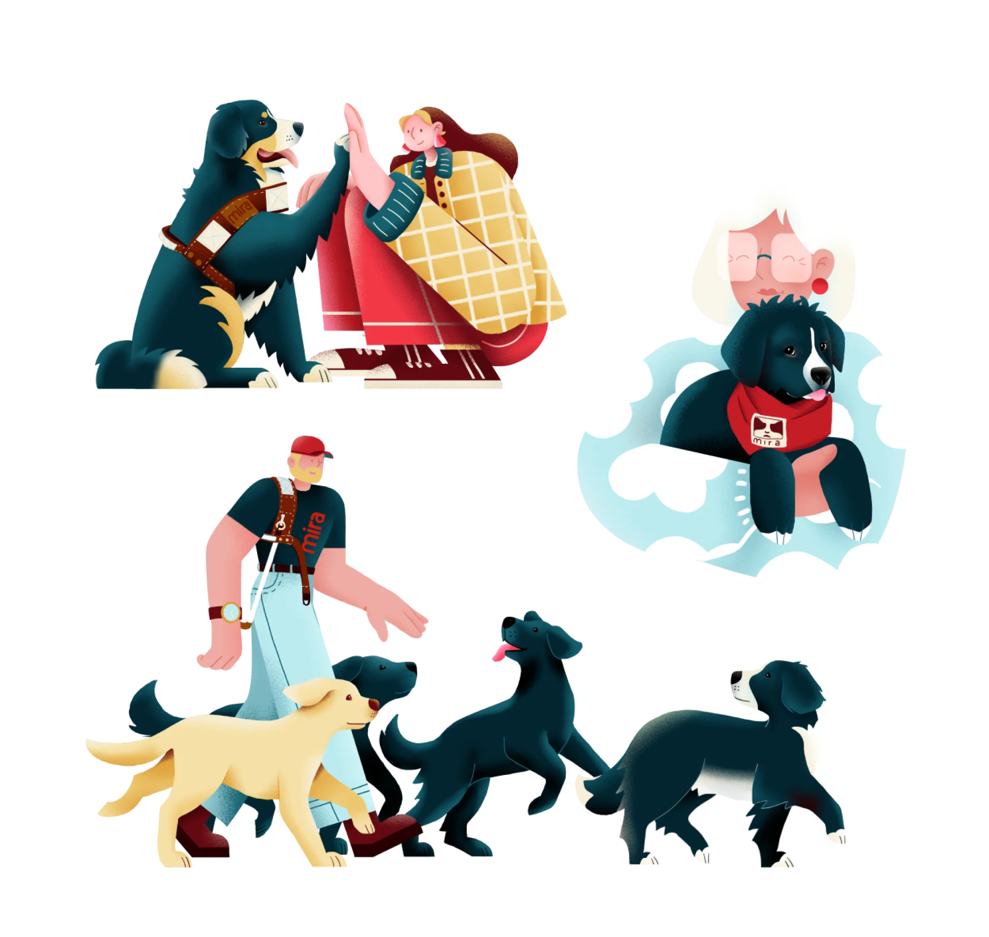
Illustrations
The Illustrations, created by Montreal illustrator Teresa Ducamin, bring a dynamic touch to the visual identity. They help express Mira’s world in a playful and creative way, while supporting the storytelling of the human experiences that define the organization.
They notably feature:
our beneficiaries;
our dogs;
our foster families;
our team.
You will discover our various illustrations over time across our platforms.